Connected timeline
A single vertical route turns separate monthly contributions into a coherent annual narrative.

CREDO Mobile · Year in review
An infographic and campaign system that turns twelve months of member-directed donations into one clear, celebratory story.
The brief
CREDO members help direct donations to progressive nonprofits every month. The year-end review needed to celebrate that shared impact while making a large amount of information approachable.
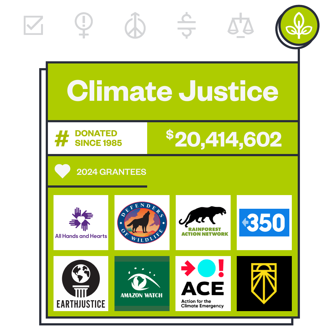
Working within CREDO’s established cause icon system, I designed a connected annual story and adapted it into focused moments for email and social—without losing the relationship between the causes.
Visual system
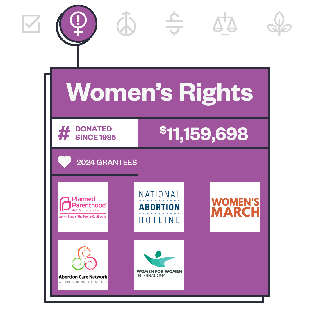
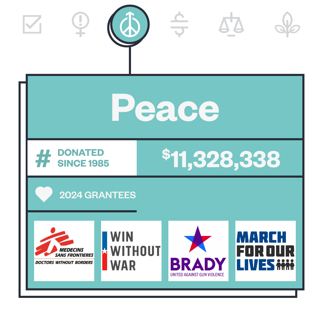
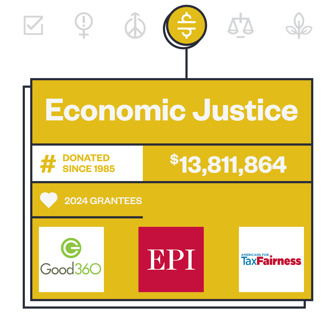
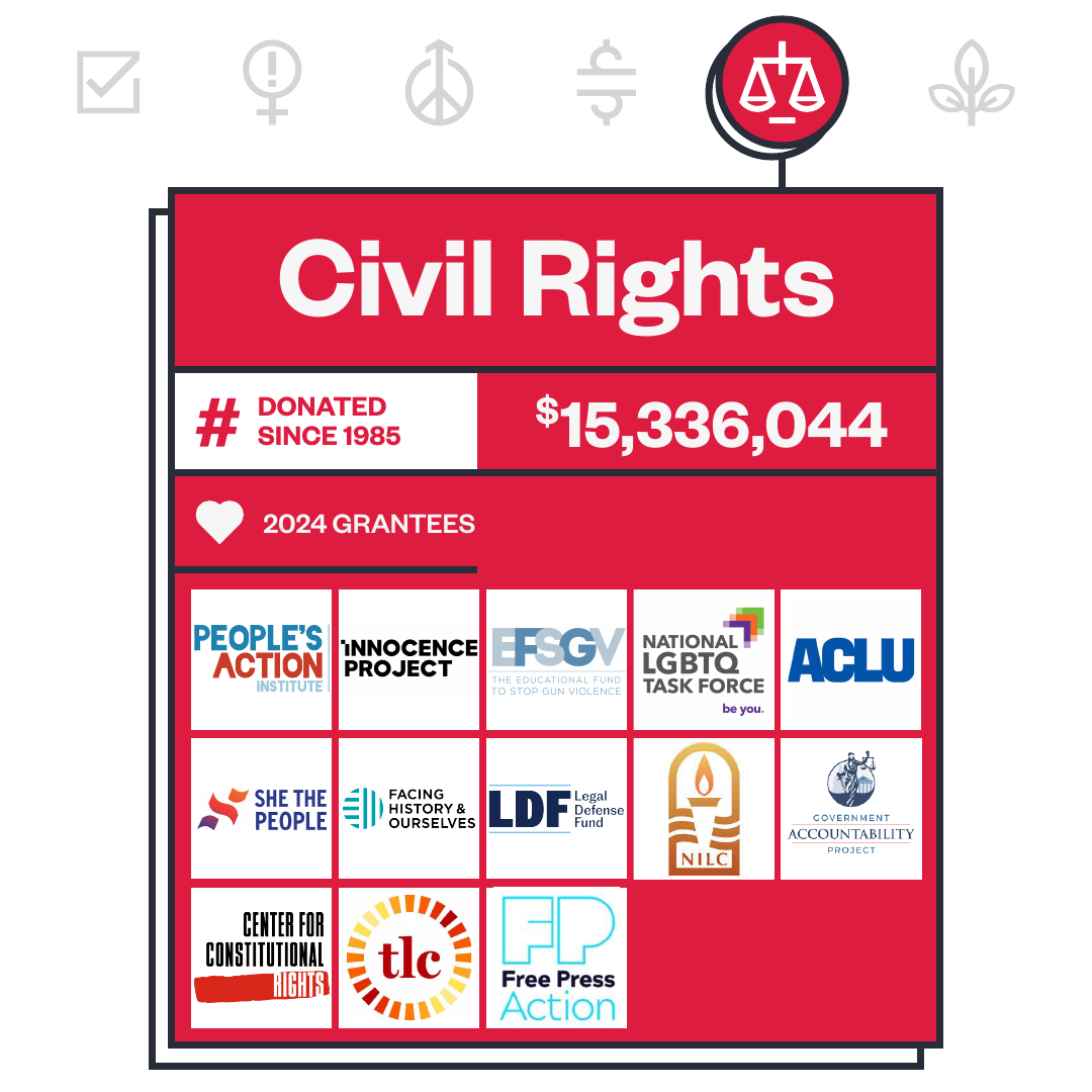
A continuous line carries the reader through the year. CREDO’s existing cause colors and icons anchor each section, while the timeline and repeated panel structure keep the full story connected.
A single vertical route turns separate monthly contributions into a coherent annual narrative.
CREDO’s existing cause colors and icons provide clear orientation and recognition across the story.
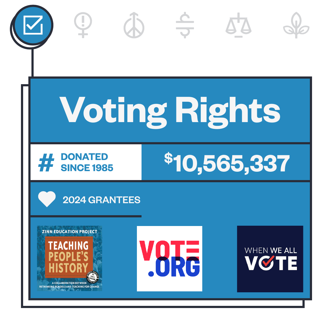
Offset outlines, modular panels and a clear data hierarchy extend the infographic naturally into email and social.
Email experience
The long-form infographic becomes the body of a member email. Its repeating rhythm creates natural pauses while the connecting line encourages readers to continue through every cause area.
Scroll inside the email to explore the full infographic.
Inbox
Final system
The result is a modular campaign that can move from a detailed email to a quick social swipe while preserving the same hierarchy, optimism and sense of collective momentum.
